

Turning Pictures Into Books
The basic materials that create things

In this post, I discuss ten processes that were fundamental to turning a load of image files into a beautiful photobook. I am very excited about the upcoming publication of my new Gingers of America book. It has been several years in the making, beginning with travelling to the States and finding people to photograph.
The book will be published in September 2026, and it goes to print soon. Support me by pre-ordering a copy and sharing this post! There is a pre-order discount until Friday, 17 July 2026. Get involved!
Print
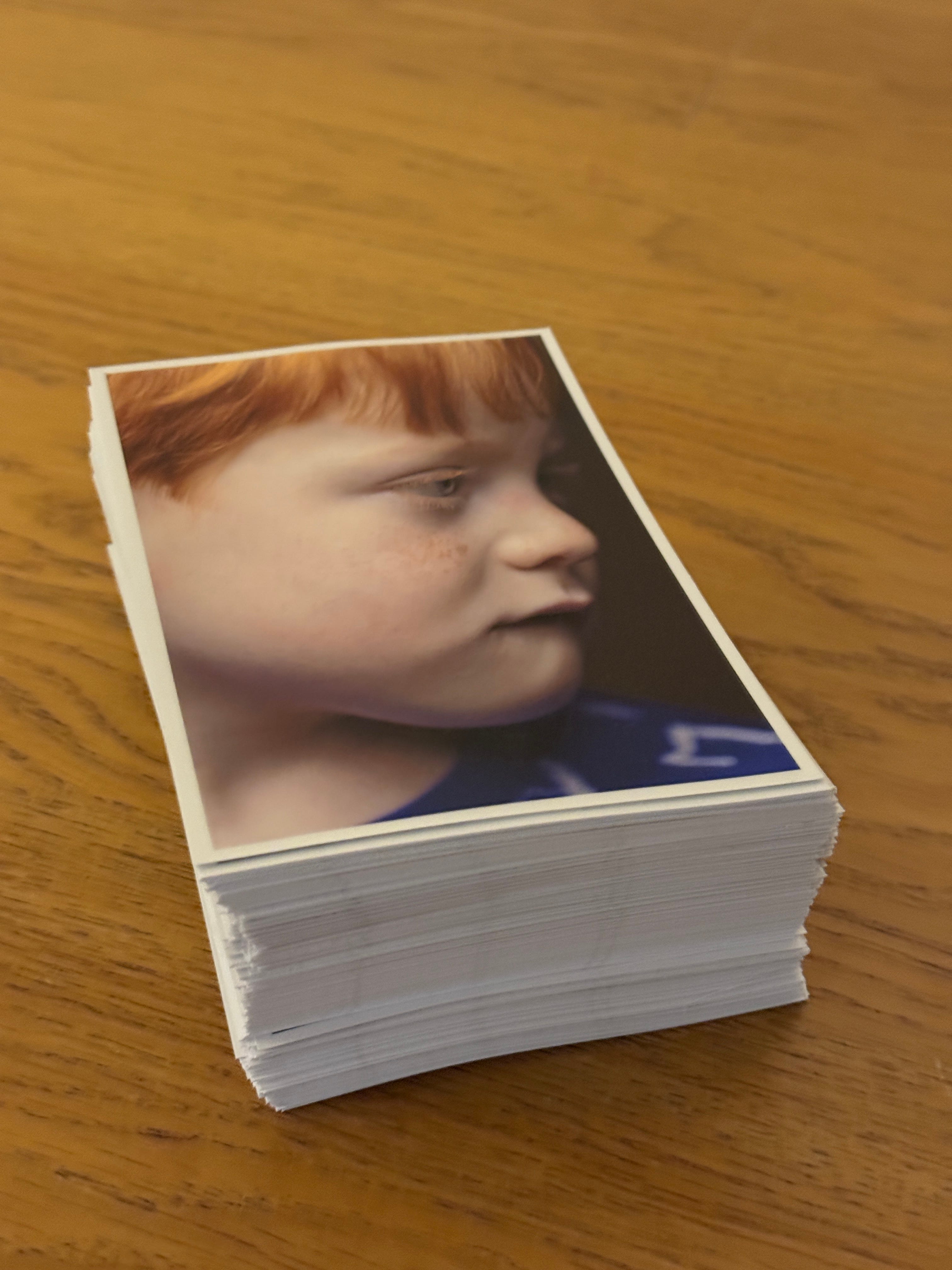
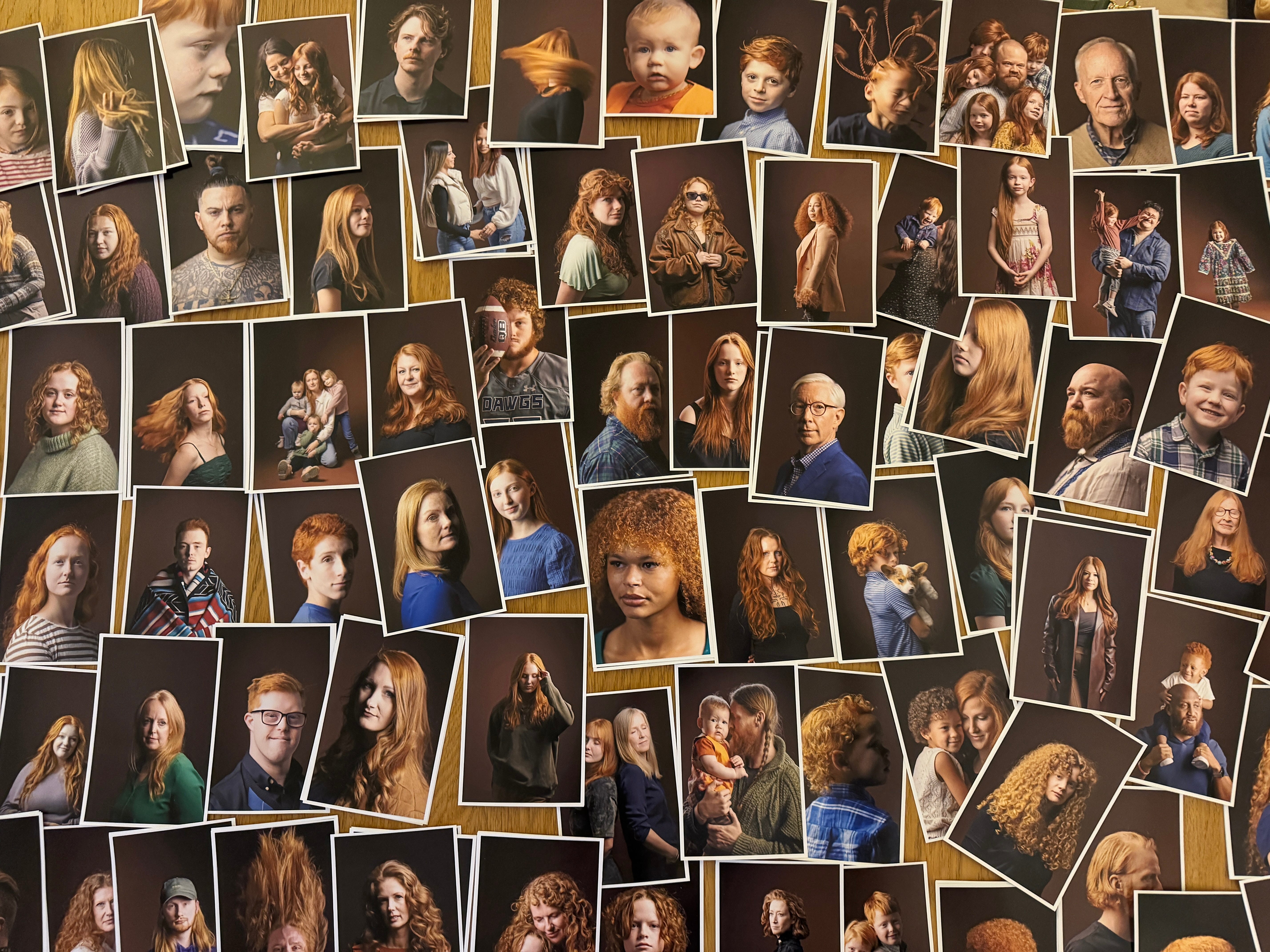
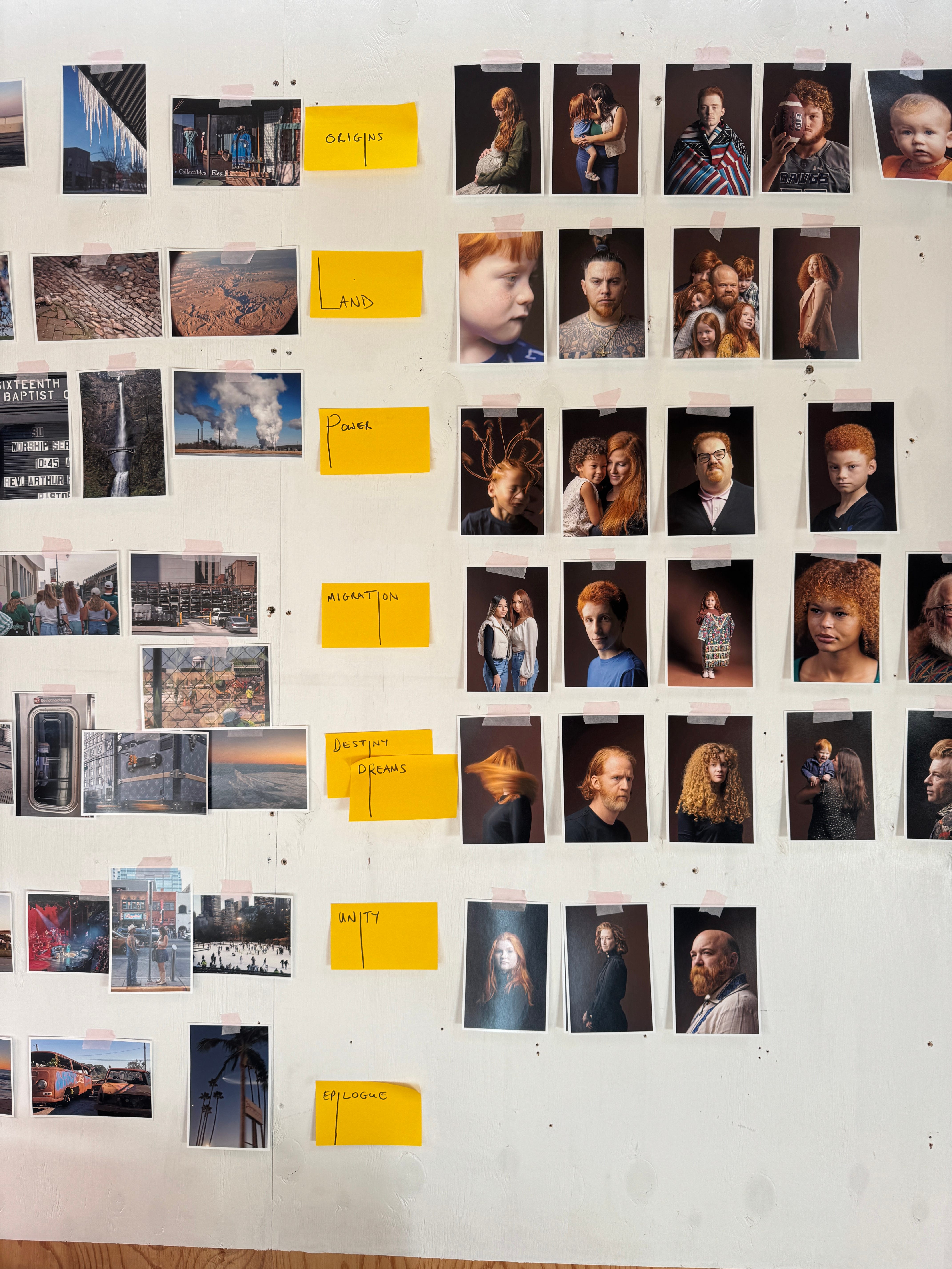
It sounds obvious, but to make a photobook you need photos. Physical, printed photos to make the book feel real as early as possible. I made a wide selection of portraits and adjusted levels so they were consistent. Then I made lots of cheap prints. I was able to pin these up on a wall, spread them out on a table, play with groupings and orderings and generally visualise how they would work together, far better than I ever could have done on a screen.
Observe
In photobooks, just as in the magazine pieces I have worked on over the years, a sequence of images tells a story. That narrative may be explicit or more subtle. My first Gingers book was a typology, composed solely of portraits, following a short introduction. Readers loved the images but said they were curious to learn more about the subjects all of whom I had interviewed. In Gingers of America, I decided to make the narratives more explicit, and to use the interviews. I asked people where the hair appears in their family and that generally brought up origin stories: everyone in America has at least one of them. Then we moved to discuss what unites the States today. That was equally interesting, and certain themes recurred.
Chapters
I decided to use these recurring themes to structure the book into chapters. Photo editor Marc Prüst, who has assisted on all my photobooks, helped me get a better sense of the shape of the whole book, and I then worked on the sequences within it.
Landscapes
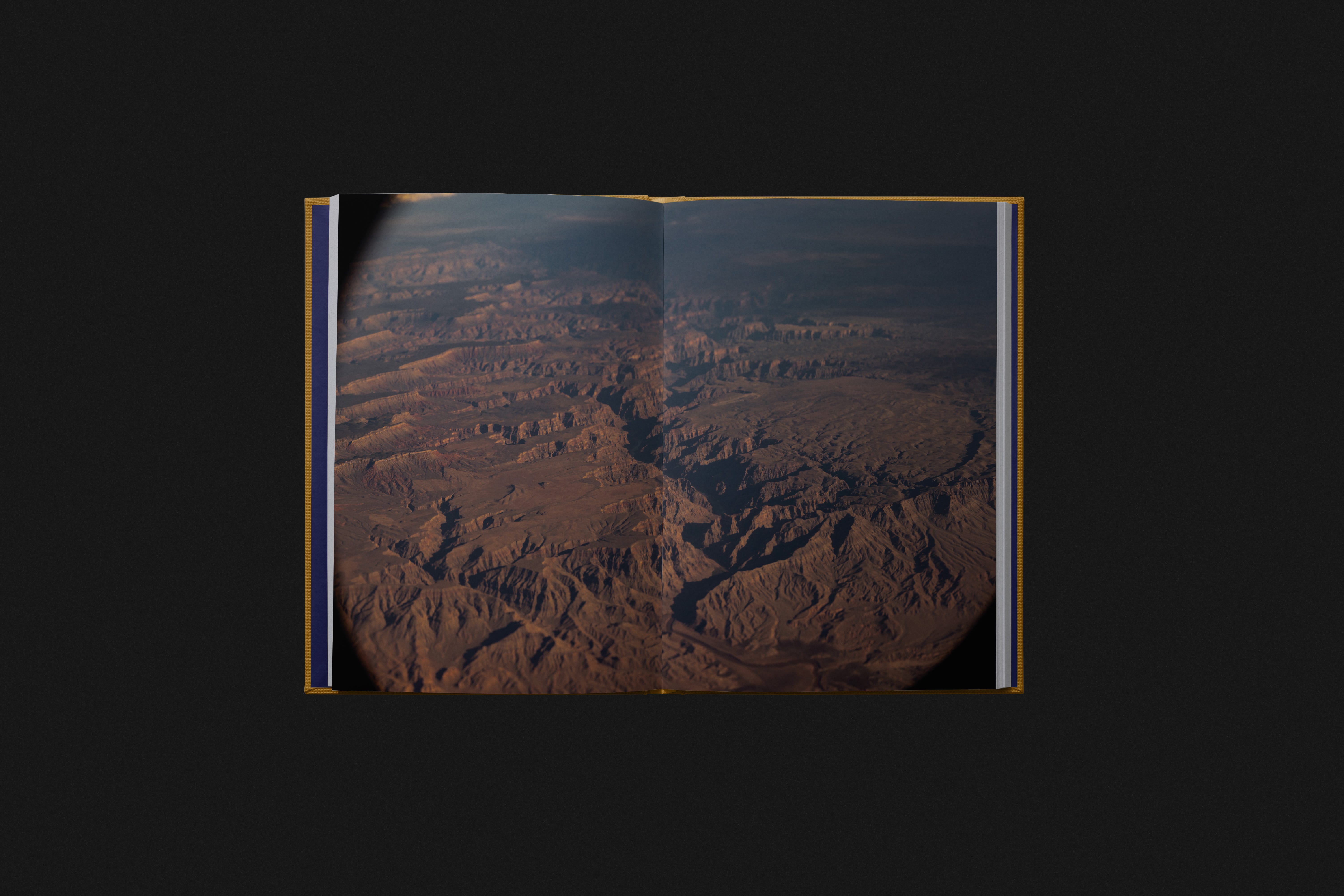
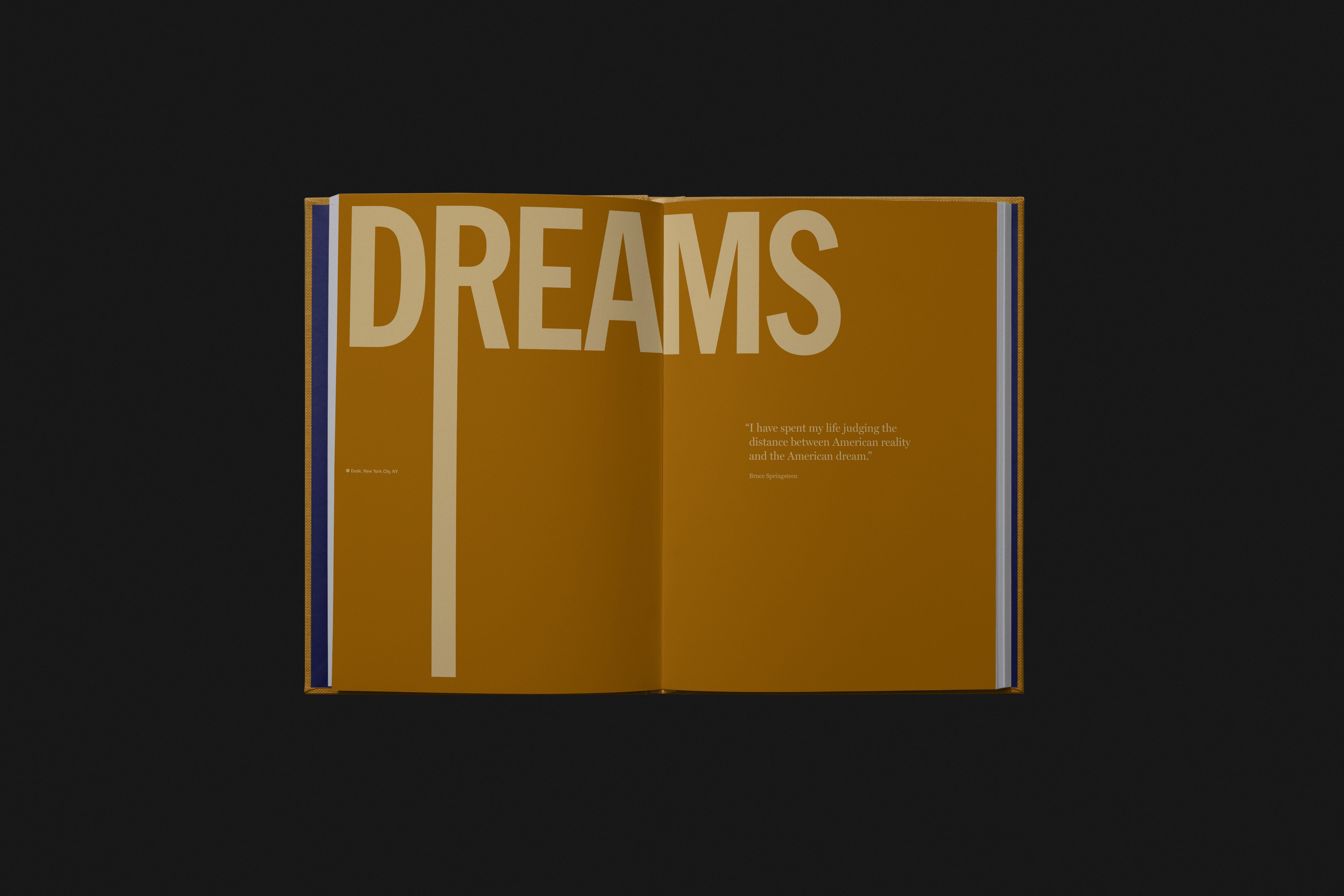
At the start of each chapter, I decided to include landscape photos I had made while in the States. Landscape photography is my main style, tracing the way human culture shapes it physically but also how we view a landscape. So, it felt right to include this geographic context alongside the portraits. These landscapes link to the larger theme or the essay itself of each chapter but also connect across the whole book. You can view the landscapes as one sequence in themselves. The book oscillates between the big-picture flyover view of the USA at 30,000 feet, smaller landscape details, and a face-to-face street view. That seemed the right way to understand a nation; indeed a big inspiration for me was an extract by Samuel Johnson about the common life and how it can reveal the state of a nation. I open the book with this quotation, and it is epic.
Essays
I hide in cafes around Edinburgh to write. After days of reading and editing interview transcripts, I began gathering material into essays around each chapter’s theme. Each essay I wrote flows from a travelogue and weaves individual stories of the portrait-sitters together. Pulling off the use of this rare golden trait to weave together the story of the nation was very, very hard. I was aided massively by my book-editor friend Sarah Ream. Like Marc, she draws out what is there and helps it flow. Across all fields, good editors make the world a better place. The book also uses pull-out quotes to emphasise key people or ideas. Including them made sequencing even more of a challenge; the visuals had to flow, the narrative of the chapter had to connect with them, and the quotes had to fit. Another reason why sticking prints to a wall was so helpful. Pulling all of this together took a very long time: staring and swapping, until, like a jigsaw, it was finally solved.
Format
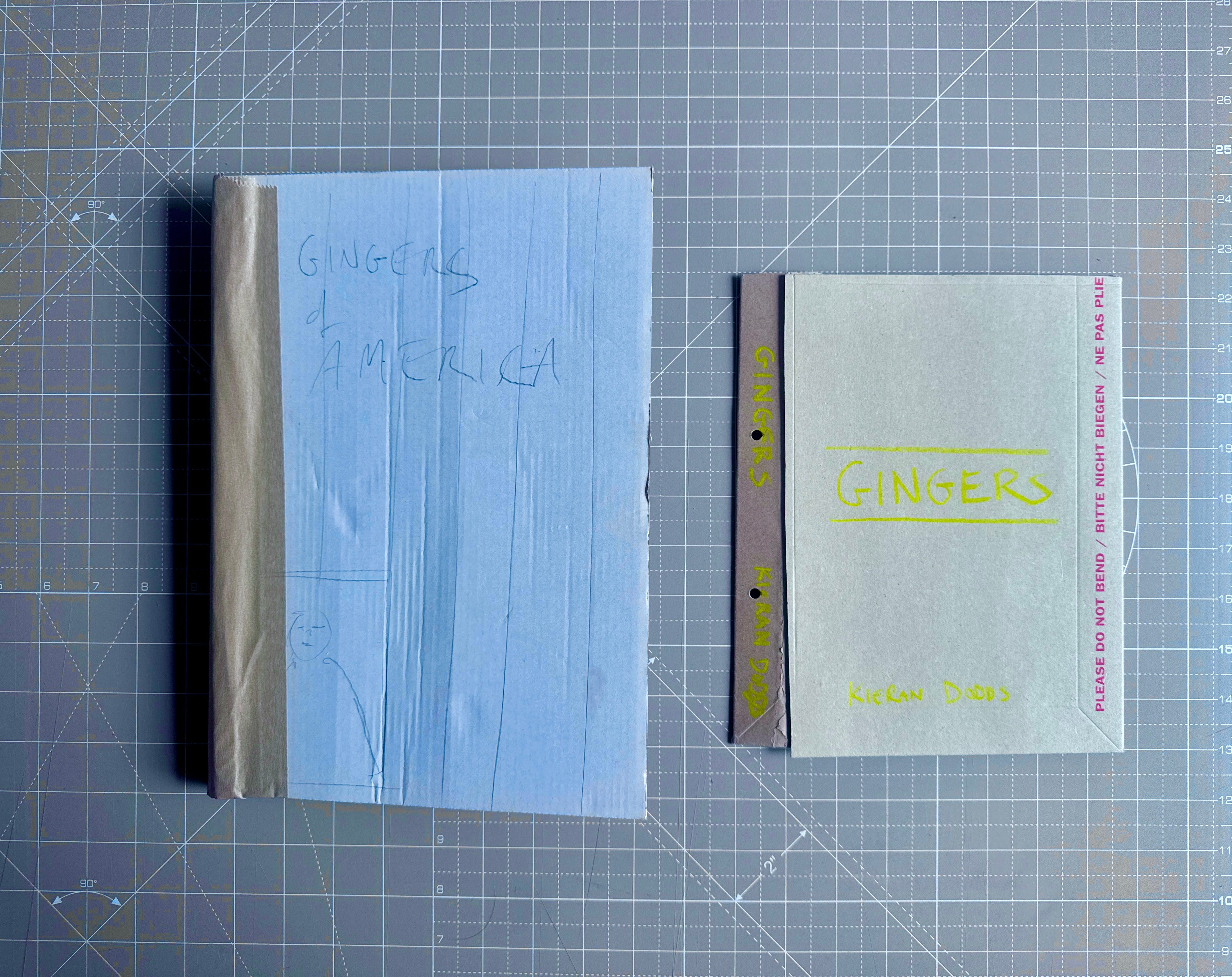
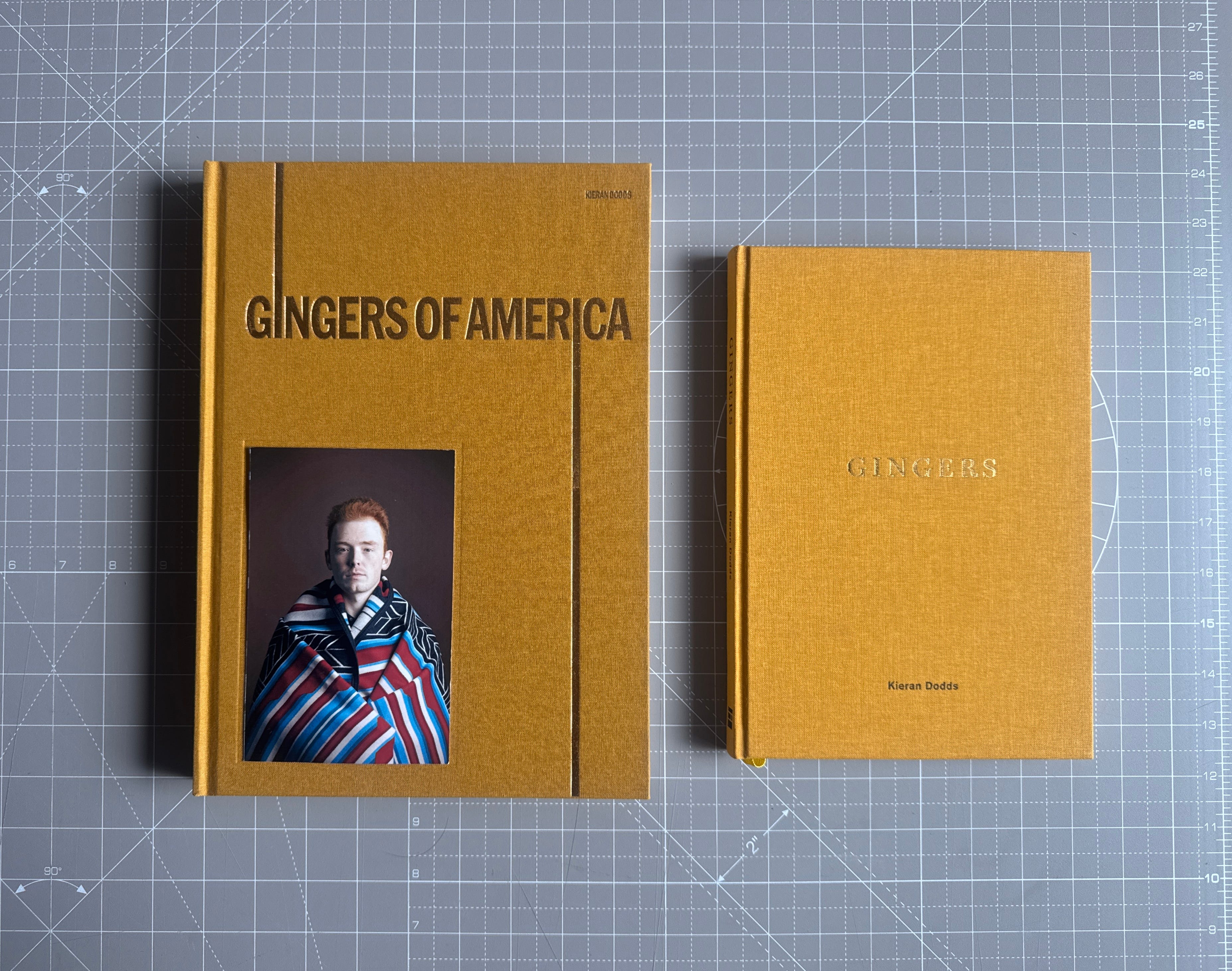
I made a mockup book early on to see how it would feel in my hand. I wanted a bigger book than Gingers; it is America after all, but also it is doing something more. So I wanted it to feel substantial but also readable, like the favourite photobooks I go back to time and again. A book to browse and enjoy over years, in which every page feels carefully crafted, because it is. This is also a stage when I began considering production costs, although I am often driven by artistic idealism initially.
Concept
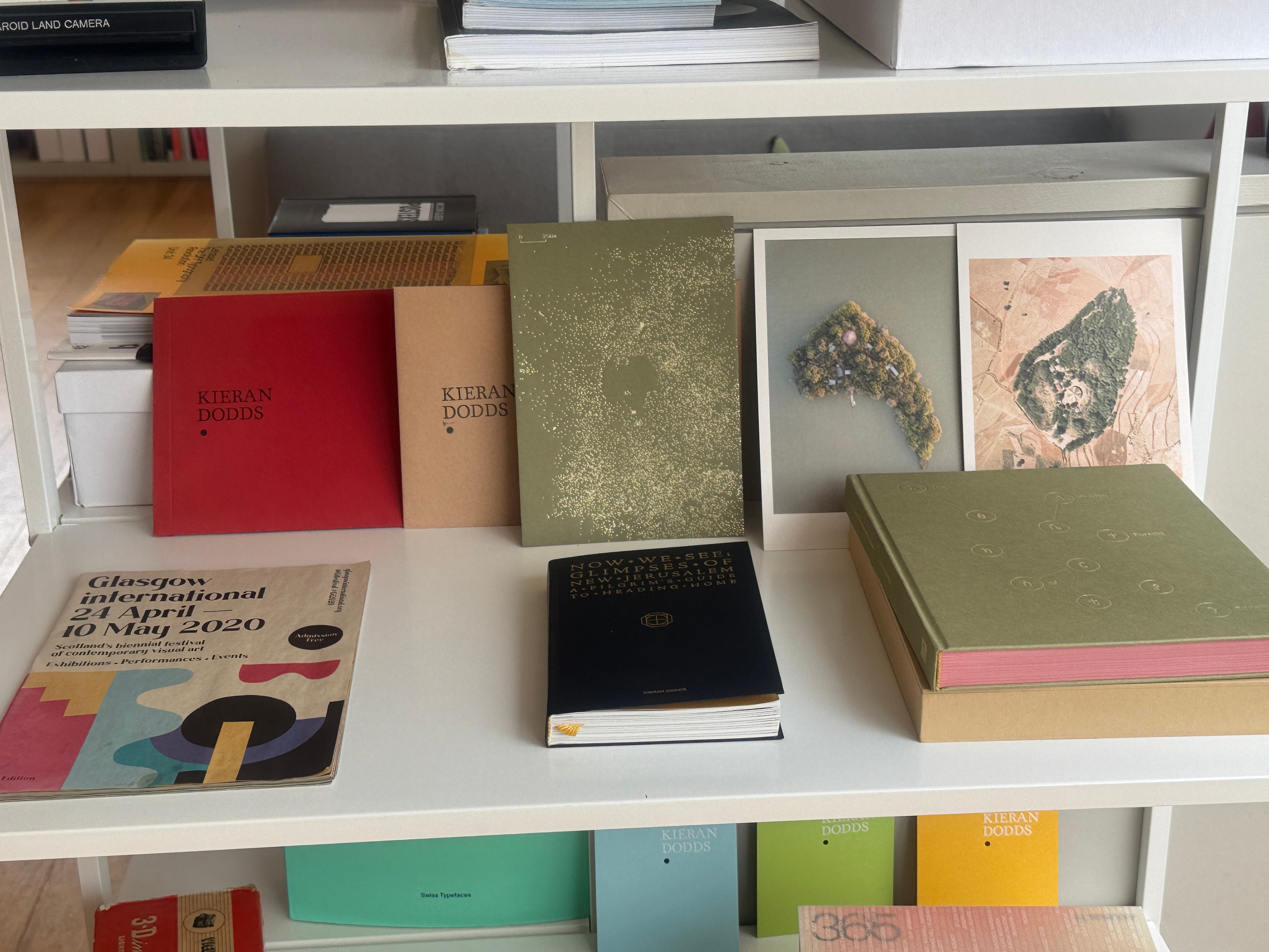
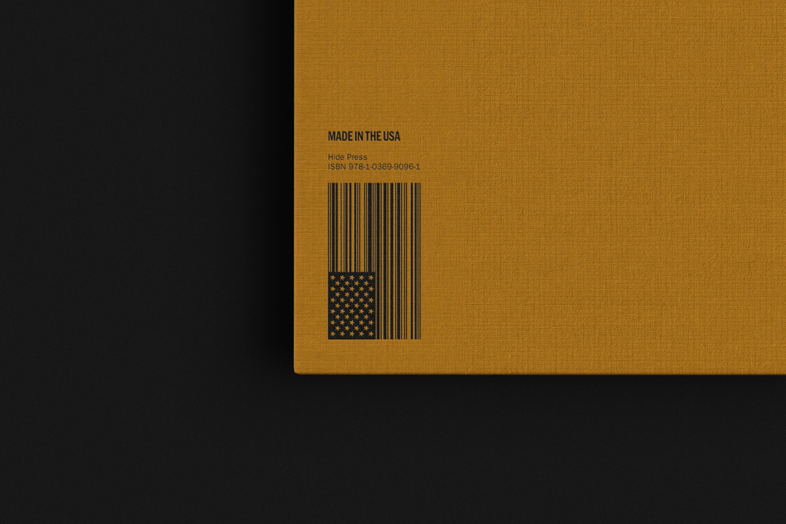
My designer Ed Watt is currently glowing after his studio, Need., was recently awarded Scottish Design Agency of the Year. Ed and I have worked on many good things over two decades (see picture above), and this felt like a milestone project. I say often that the divine is the detail, and that was definitely the case for this book. The design of the book really deserves a post of its own. We developed the idea of nodding towards a family tree, with name, state and year of birth for each portrait, as I had done with my previous Gingers book. We wanted to keep the layout spacious, like a monograph, in the portrait sections. The other major motif was a thread of golden hair connecting people, and this idea flowed into the font design. The long lines work as American flag stripes too, but I wanted a light touch here, as the book is as much a global as a national story. The flag-shaped barcode on the back cover is a favourite detail, though.
Materials
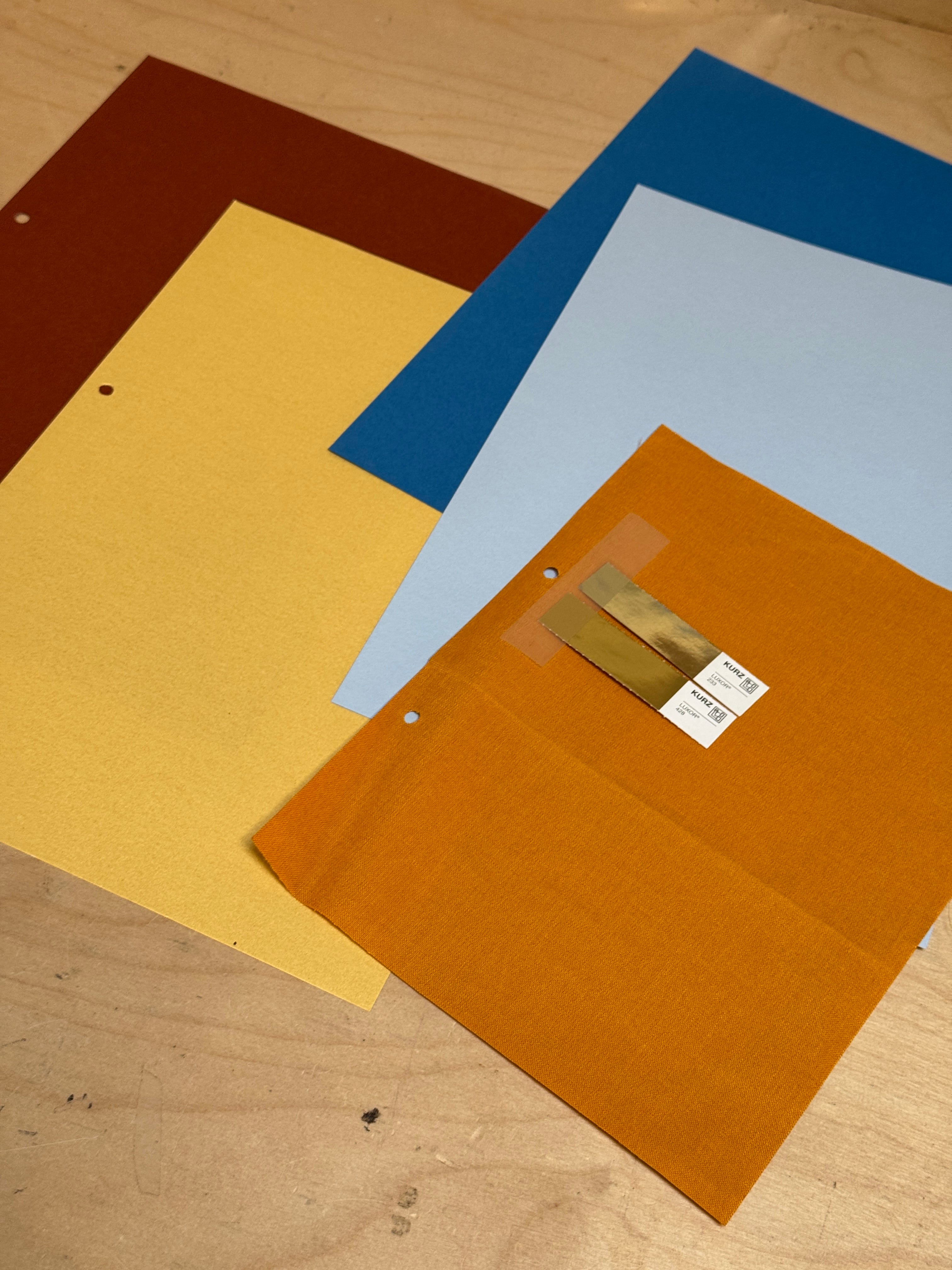
The narrative ideas are the skeleton of a book, the visual content makes up the body, and then we get to dress it in paper or cloth. I am always tempted when I see a nice cover-cloth sample, but I wanted to see how the interior of the book shaped up first. The book may appear to be about a certain colour, but that did not necessarily mean that that colour should be on the cover. That said, I ended up choosing a fabric close to that of the orangey Gingers. The use of a tip-in portrait also affects the color perception, so we opted for a slightly less vibrant tone to let the inset portrait pop out. As we are printing in the United States rather than the Netherlands (as for my previous books), I have had to choose a different paper to my usual Fedrigoni. Each book brings its production challenges, but having found a trustworthy guide in the States, I am working through it with them.
Trials and Errors
Printing books is an extreme sport for the independent artist. A lot of money is on the line, and a book feels like a momentous work of art. I fuss over details people will maybe never notice. Those who have worked on it know that, and thankfully they are obsessed about their work too. In the end, it has always come good. I always get wet proofs (printed sheets of the book) to test the look, feel, and colours.
Pre-order
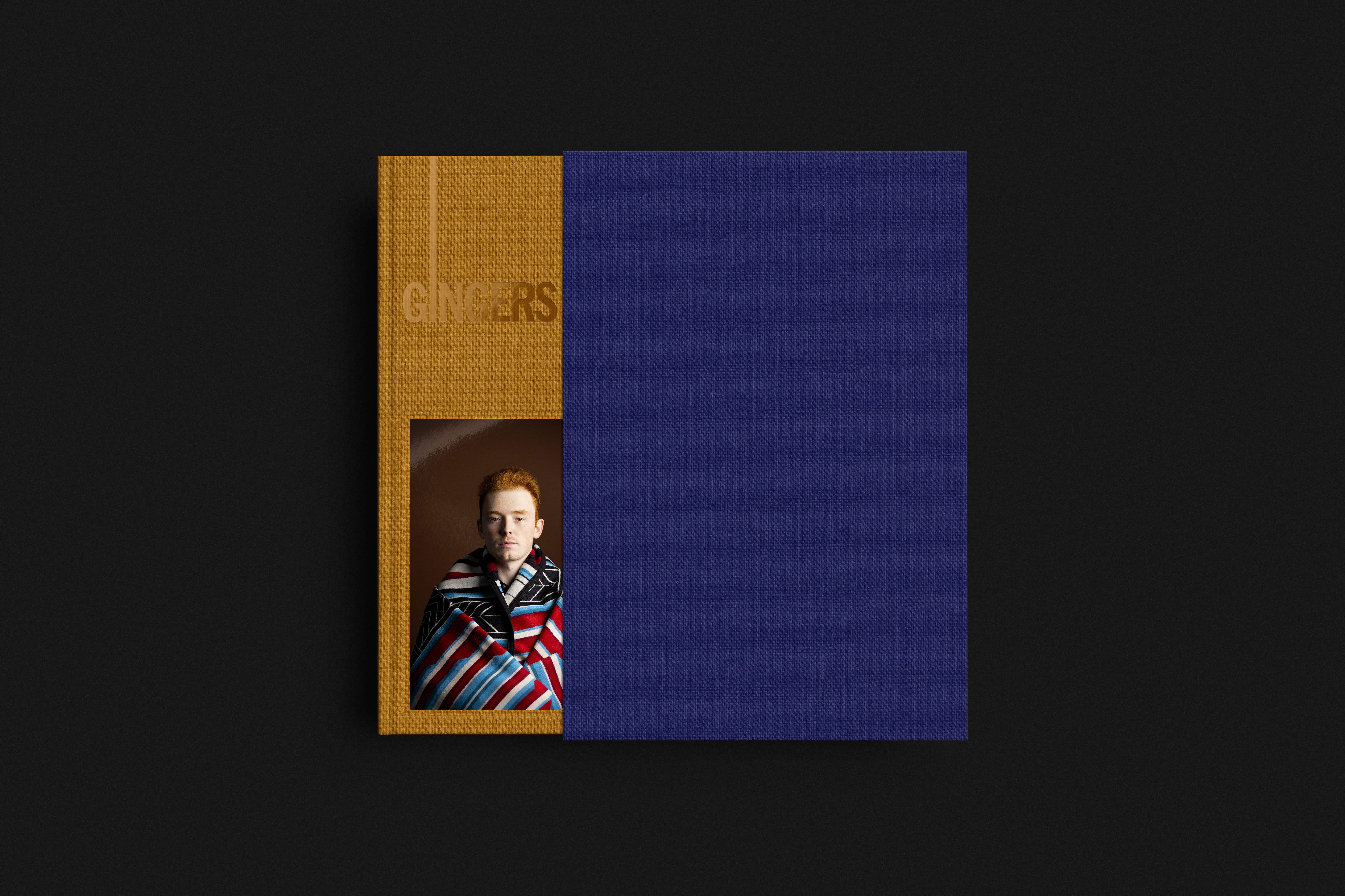
Once everything is done, months have passed. I am wearier and greyer, and it is over to you, the audience, to grab a copy early with the generous pre-order discount. The first hardback Gingers book sold out on the pre-order and we had to print even more paperback versions. I always try to tell people to get it now, not just so I have cash in the coffers to pay the printing bill (though this is hugely helpful), but because subsequent editions of the book may not be quite the same in the future. Order one while you can, and check out the gorgeous special edition with a contrasting slip cover.
The pre-order discount ends 17 July 2026. That’s only a week today!